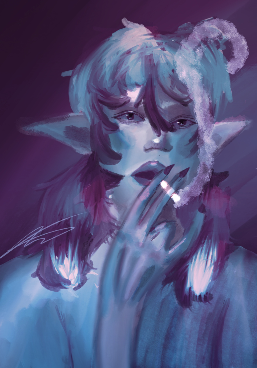
Blue Elves Smoke
I was given the ability to choose what i wanted to do as a project, so i chose to do the medium and style i am most comfortable with. That medium is Digital creation of art. I drew this piece on my phone, on a art app that ive used for years. This style and way of creation has always been my preferred way of art. My final piece isnt supposed to realistic or clean. Its a stylistic choice to mkae the lines not slick and connected, to make the lineart not blended into the colors. If i where to do that, it would look more realistic, so i stuck with keeping it looking very cartoon like.

1668 x 2388px
Procreate on Ipad Pro
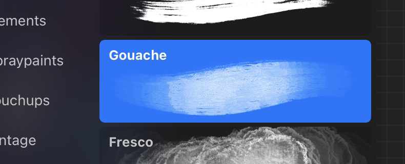
Gauche Paint Brush
Procreate on Ipad Pro
Gauche Paint Brush
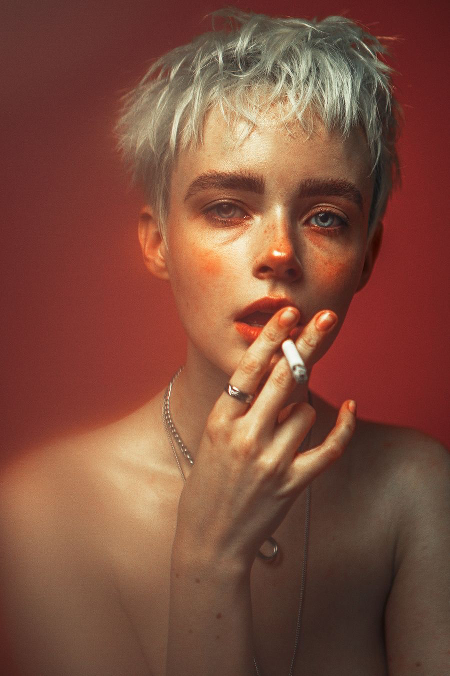
Reference photo

The reference I chose was a random photograph on pininterest with no specific credits to the photographer. I loved the complexity of the lighting and bright red highlights that adore the persons cheeks. The highlights and shadings all helped me place the colours where they needed to be, making it easier to know where the light shined. Although I didn’t keep with the original colors i liked the difference between warm and cool tones of the painting. While also twisting a little fantasy spin on my piece.
My Process
|
The first thing i do when it comes to digital art is the line art. I do sketch out the placement for the eyes, nose, ears, and lips so the face is proportional. Then i sketch out the hands and body loosely keeping it easy to fix just in case i made an error. My style shows with the way i draw the eyebrows, nose, lips, and hands the most. I keep a very realistic approach to the drawing, but i usually do cartoon so it turned out semi realistic. As the peice goes on I stop using the line art as the main outline, and use the Gauche brush to paint the outlines and details. The background was created to help me figure out where the lighest of my color choices are going to be. I chose yellow, to a dark night blue to help me. I blended the two down the middle. |
|
|
The way i color in skin is i pick the base which is going to be the medium most shade that is going to outline and fill the entire skin. Then, I chose a darker shade to use to color in the shades of the face, located where the hands meet the fingers, underneath the hair, the tips of the pointed ears, and underneath the nose. I then choose a red/orange color to further contour the hands, and also cheeks of the person. I exaggerate the blush underneath the nose, on the knuckles/fingertips of the hands, and the uppermost tip of the ear. Which is a stylistic choice to contour and show definition in the hands, I still use the Gauche brush the entire peice. I also stick with using the same colors of the original reference of the photo to make it more obvious where the lightings should go. I know i can change this later in the peice to a cool shade using the Gradient Map tool. After I’m done contouring i find the highest part of the persons body and place a very light yellow/red color on it then lower the opacity.
|
|
While coloring the hair i used a tool called the Select brush, which is able to fill in a area that you desire when you outline it. I find it easier for me to use the select brush while drawing hair because it allows for definition between the strands of hair. I use the darkest colors to outline the face, then slowly work up to show the light hitting the top of the roots and fly away hairs. I make sure it is all blended using the blending tool, while also using said tool to create more strands in the hair by smudging the colors together.
|

|
|
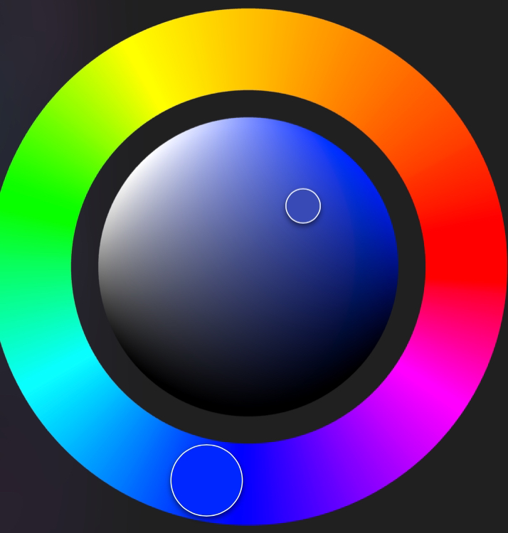
To change the original warm tones of the painting to the cool ones, I chose a gradient map that edited the hues and also simply moved the colors to the respective spots on the color wheel. With the advancements of digital art, things like this would normally not be able to be accomplished. I am able to edit the hue and tone of any color with any swipe of a brush. That doesn’t make it easier or harder than traditional art. Both have respective difficulties.
|
Compare and Contrast
|
|
Contrast
-The reference photo is warm toned, while my painting is cool toned.
-My work is a digital gouache painting while the other is a photograph
-My lines are not sharp and don’t define the jaw, neck, or hands, while the photograph captures all the sharp definitions. My painting is more blended.
-The painting is based in a more fantasy view, the skin color isn’t natural, and its a elf. While the photograph captures a human.
-The smoke is visible in the painting.
Compare
-Extreem saturation of colors when it comes to the highlights and blush contour
-the poses are the same
-There is a overlay that blends the main body into the background.
-both are nude and not wearing clothes
-
ACT Questions
- Clearly explain how you are able to identify the cause-effect relationships between your inspiration and its effect upon your work? I used the reference photo that i found and adapted it into my own semi-realistic digital creation. The reason i chose the photo as reference is because of the pose and over all look of it, using the egaturated features of the blush, to putting it onto digital art and effectively stylizing it. To be able to adapt real life into fantasy.
- What is the overall approach(point of view) the author (from your research) has regarding the topic of your inspiration? The over all approach i wanted to go for in this piece is staying true to my own personal style and preferred medium, while also branching off and using a brush I wouldn’t normally use to paint my pieces. The photo I chose as reference was simply the inspiration of the pose and the use of saturated blush. The colors all ended up opposite.
- What kind of generalizations and conclusions have you discovered about people, ideas, cultures, etc. while you researched your inspiration? That being true to ones personal style and medium choice can create more of a creative boost than being refined to a project that is told to be created. That anything can iinspire you even a simple photo that you can find on a website.
- What was the central idea or theme around your inspirational research? The color choices and how to stylistically put that into the painting. Using. A new brush while staying true to my realistic, cartoon like approach to the reference. Although i did stick with keeping it semi realistic with a fantasy twist.
- What kind of inferences (conclusions reached on the basis of evidence and reasoning) did you make while reading your research? That there is many things that can go into creating the meaning and the execution's of ones work. It doesn’t even have to inspire someone to use the same medium.
