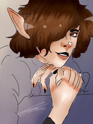
Personal Project
I was given the ability to choose what i wanted to do as a project, so i chose to do the medium and style i am most comfortable with. That medium is Digital creation of art. I drew this piece on my phone, on a art app that ive used for years. This style and way of creation has always been my preferred way of art. My final piece isnt supposed to realistic or clean. Its a stylistic choice to mkae the lines not slick and connected, to make the lineart not blended into the colors. If i where to do that, it would look more realistic, so i stuck with keeping it looking very cartoon like.

1440 x 1080 px
Personal Project
Reference photo
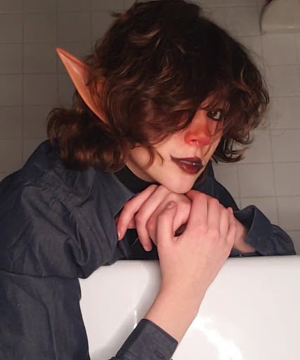
This is the reference i chose to do my piece after. Its actually a photo of myself, posed in the bathtub, leaning over it. I did my makeup very similarly to how my artwork is styled, all except for the darkened upper lip. Its shown by the exaggerated blush of my nose and lips. I used the pose and myself as reference to create my work. The final product being a semi-realistic cartoonist rendition of the realistic photo. Of corse, not everything is realistic in this photo. Especially the pointed elf like ears that I am wearing. Ive always been drawn to fictional beings like elfs and demons so creating a art peice around it seemed like a no brainer. So i used that reference to create the final digital rendition. As if i was in a fictional comic about elves and other beings.
Photos |
My Process |
|
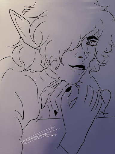
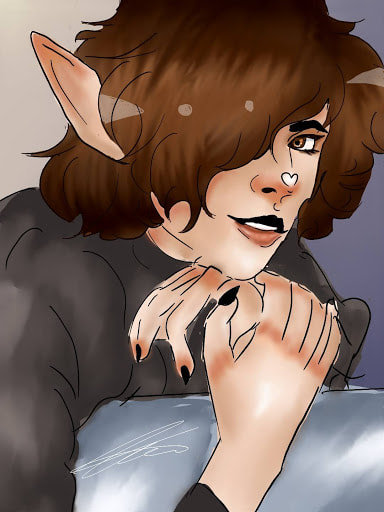
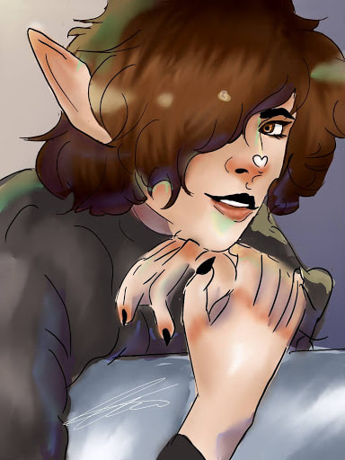
The first thing i do when it comes to digital art is the line art. I do sketch out the placement for the eyes, nose, ears, and lips so the face is even. Then i sketch out the hands and body loosely. My style shows with the way i draw the eyebrows, nose, lips, and hands the most. The Boldest part of the black line art are focused in those areas.The eyes are alot more animated, the fingernails are more exaggerated, and the top upper lip is blacked in. The background was created to help me figure out where the lighest of my color choices are going to be. I chose yellow, to a dark night blue to help me. I blended the two down the middle. |
|
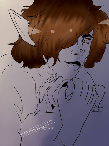
I then start doing the color. When it comes to hair, which is what im filling out, i pick three colors, one darker, one in the middle shade, and one lighter. I then blend the three together, and use a smeer brush to bring the light parts into the dark to create the strands of hair. When it comes to my style, i create unrealistic highlights in the corners in the shapes of triangle and circles whiten the highlighted part of the strands.
|
|
The way i color in skin is i pick the base which is going to be the medium most shade that is going to fill it in entirely. Then, I chose a darker shade to use to color in the shades of the face, located where the hands meet the fingers, underneath the hair, the tips of the pointed ears, and underneath the nose. I then choose a red/orange color, to fill in a blush look to it. I exaggerate the blush underneath the nose, on the knuckles/fingertips of the hands, and the uppermost tip of the ear. Its a stylistic choice. The bottom lips turn realistic, contrasting the dark black upper lip that is above it.
The eyes are a light brown color, more orange. I use the pupil i created originally in the line art to focus around it. Using the darkest shade of brown/orange above it, then the lightest below. Using white to make small sparkles underneath the pupil. |
|
When coloring in the clothes, which is shaded grey with a red undertone. I had to put in consideration when figuring out where i decided to shade the skin, and the hair, to make-sure the shading is all the same. To make it look like the light is hitting all from the same place. With that, to shade the clothes, i chose a medium shade of grey, a slightly darker one, and the lightest almost white shade to color it in. Using the dark underneath all the main attributes like the hair, hands, and face. and the lightest on the corners, and mid of the arm.
I then created the thing that the person is leaning on, which is nothing in particular so i chose a grey color with blue undertone, highlighted and shaded it to fit the colorations. |
|
the last thing i did to the piece is a stylistic choice. I chose highliter colors of yellow, green, and blue, then a dark grey toned purple. The yellow and green highlight the most bright parts of the hair, and outfits, along with the skin. On the tips of the fingers and hair. The dark purple is used to give a bit more shade and definition to it. Located on the bottom of the hair, and the sides of the fingers. The blue is there to give a contrast of shade, but is used as if it was a darker color. Its a stylistic choice that brings together my peice the most. The focus point of the colors.
|
Inspiration
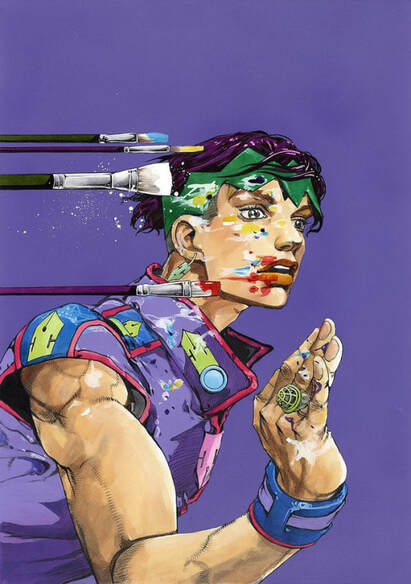
Hirohiko Araki

This is Rohan Kishibe, Hirohiko Araki's character in one of his manga Thus Spoke Rohan Kishibe and Jojo's Bizarre Adventure. The colors are what inspired me the most. The highlights, the saturation, and the strokes of the brush all connect into something i wish to bring into my piece. Although my piece is less realistic than Araki's, i still wanted to incorporate the genius work of coloring inside of my piece with the highlights.
Compare and Contrast

|
|
Contrast
-My peice is a digital drawing while Araki's is a painting
-My peice is a representation of myself while Arakis is a painting of a character
-The color choises are different. My choices are a but duller and blended together while Arakis are more saturated and less blended to make the shading stick out.
-Mine has very sketchy line art while Arakis blends into the peice and is more smooth
Compare
-They are both created by prefered stylistic choices. Araki is known for his style when it comes to painting and im developing mine
-Satruated colors when it comes to highlights or extra detailing.
-the lips are very bold and stick out
-the poses are very simular and both have hands in them.
-
-
ACT Questions
- Clearly explain how you are able to identify the cause-effect relationships between your inspiration and its effect upon your work? I used the reference photo that i took of myself, and adapted it into my own semi-realistic digital creation. The reason i chose the photo as reference is because of the pose and over all look of it, using the egaturated features of the blush, to putting it onto digital art and effectively stylizing it.
- What is the overall approach(point of view) the author (from your research) has regarding the topic of your inspiration? The over all approach i wanted to go for in this piece is staying true to my own personal style and preferred medium. The photo I chose as reference was simply the backbone which created the final product. The colors where all up to me in the end, eventually going with more brighter choices, contrary to the dull colors of the photograph.
- What kind of generalizations and conclusions have you discovered about people, ideas, cultures, etc. while you researched your inspiration? That being true to ones personal style and medium choice can create more of a creative boost than being refined to a project that is told to be created.
- What was the central idea or theme around your inspirational research? The color choices and how to stylistically put that into play, staying true to my realistic, cartoon like approach to the reference.
- What kind of inferences (conclusions reached on the basis of evidence and reasoning) did you make while reading your research? That there is many things that can go into creating the meaning and the execution's of ones work.
